
YHACK SPRING 2026
Designing a Hackathon Worth Falling For

RESPONSIBILITIES
Branding
UI/UX Design
Illustrations
ROLE
Lead Designer
TEAM
Design Team (2)
Frontend Devs
TIMELINE
5 weeks (Dec 2025)
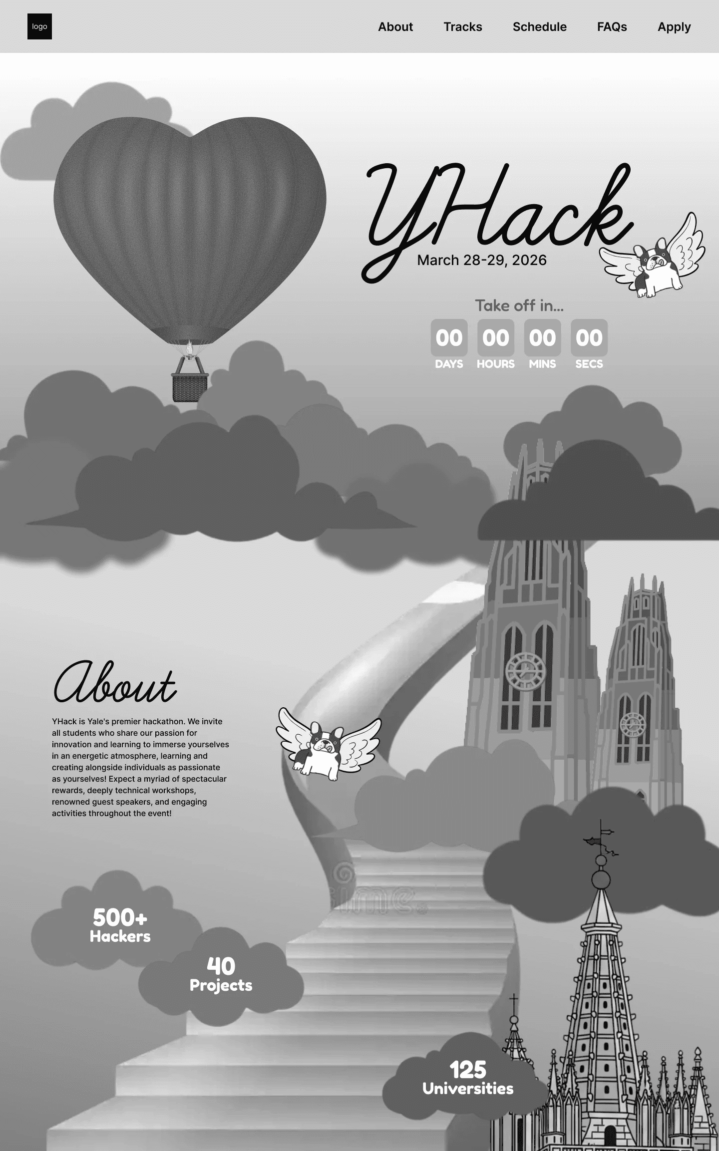
PREVIEW: WHAT IS YHACK
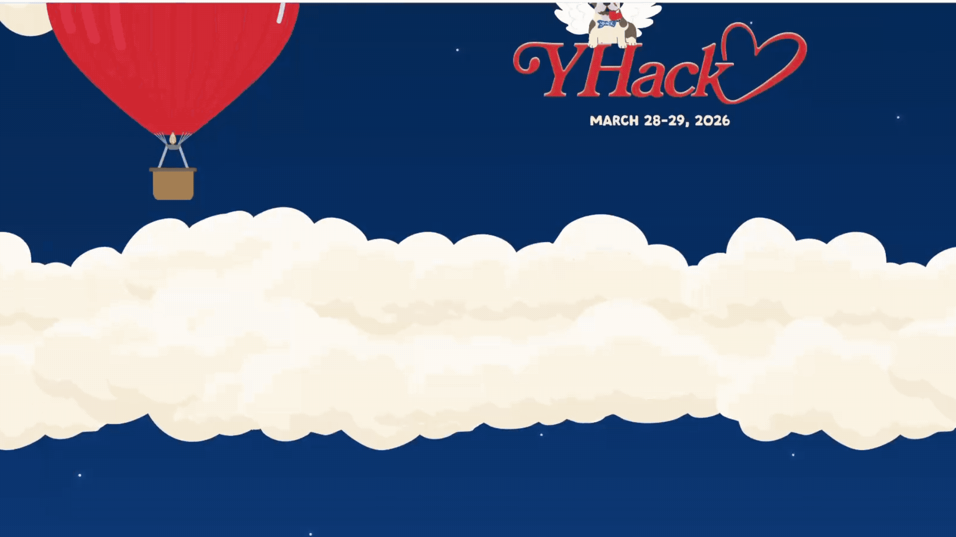
With the visual theme of love, the 2026 site takes you from sky to land with our cupid Handsome Dan. Featuring animations, romantic gestures, and hand drawn illustrations. Check out the site ->
Final Design
Phase 1: Define
CONTEXT
What is YHack?
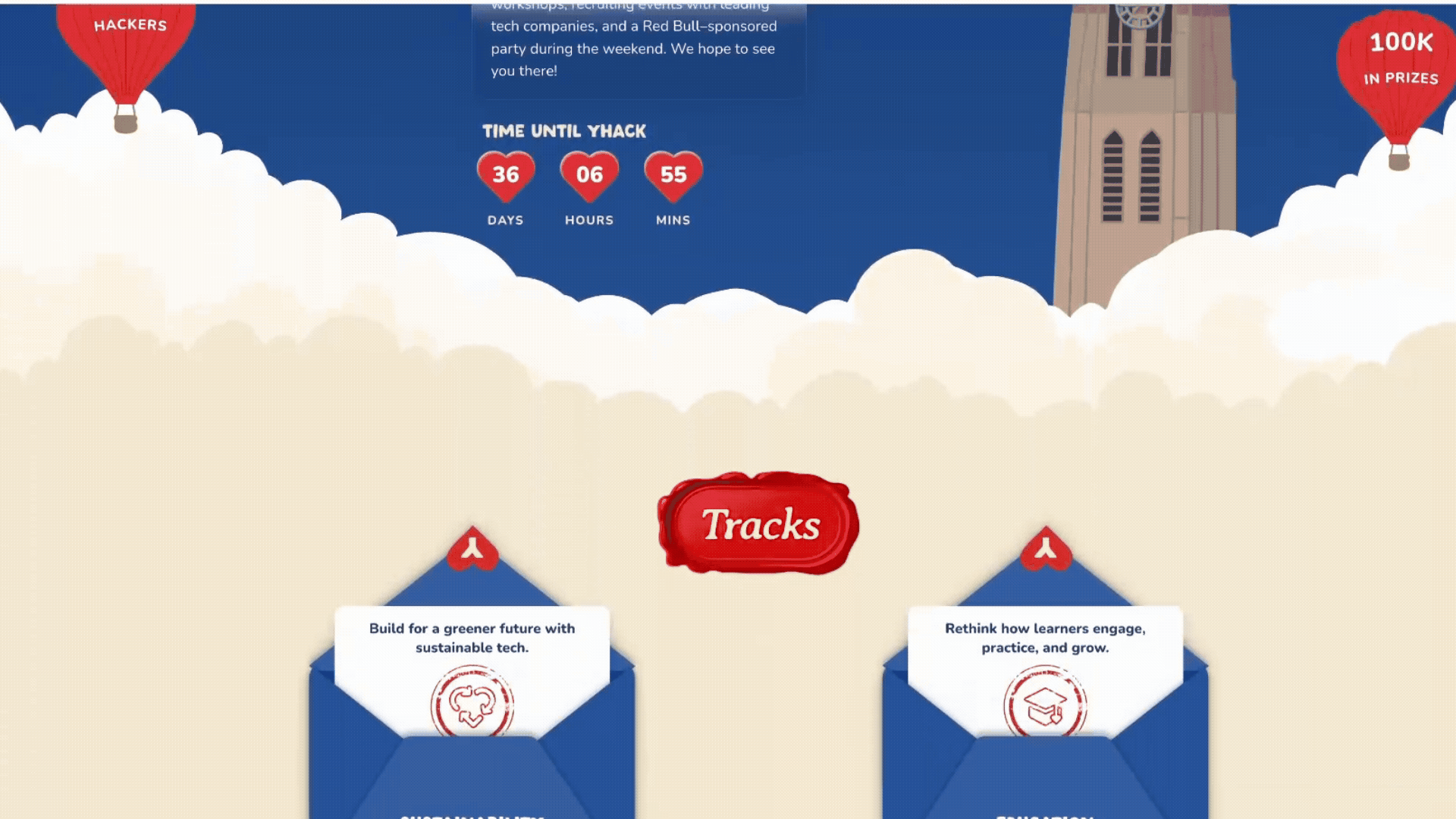
YHack is Yale’s flagship hackathon, bringing together 600+ college builders for 24 hours of weekend hacking. Participants will have access to hands-on hardware, technical workshops, recruiting events with leading tech companies, and a Red Bull-sponsored party during the weekend.
ROLE BREAKDOWN & PROJECT TIMELINE
A Quick Overview on My Creative Process
I joined YHack as a designer out of the blue during winter break — and hit the ground running. At that point, I was the only designer on the project, which meant I was responsible for things that genuinely intimidated me, including designing custom illustrated assets from scratch. My first meeting with the team was a bit of a learning curve; I had limited experience with web design and even less with hackathon websites specifically. So before touching a single frame in Figma, I put in serious research time. I started with rough sketches and a lo-fi outline, then iterated through multiple mid-fidelity explorations before arriving at a polished, high-fidelity prototype.
The Overall Project Flow
The previous designer left me with a strong foundation: a finalized color palette, the Handsome Dan logo, and the overall romantic vibe. From there, I took ownership of every visual decision — from finalizing typography to defining the full page layout and scroll experience. My research phase involved studying a range of hackathon websites to understand what worked and what didn't in terms of layout, hierarchy, and first impressions. Using those insights alongside the established visual theme, I defined how the site should look, feel, and be experienced — including page structure, content hierarchy, storytelling moments, interaction ideas, and the full list of custom assets needed to bring the high-fidelity mockup to life. I was responsible for designing everything from the Hero section to the Footer. Custom assets I created include: Clouds, Floating Islands, Wax Stamps, Envelopes, Post Cards, the YHack Logo (in text), MLH Graphics, and Sterling Library. Special thanks to Mandy Chen for helping with the illustrations — especially the cupid Handsome Dan (check it out on her page!) — and to Rohan for the patience and heavy lifting on the development side.
Team Members
Click on their names to view their page!
Mandy Chen designed four Handsome Dan variations, MLH Graphics, merchandise, created the Handsome Dan logo, established the color palette, and set the overall vibe and tone of the site.
Rohan Phanse lead developer and main point of contact for asset handoffs. Created the Harkness Tower asset and made multiple development iterations to bring the site to life.
My Role
I led the end-to-end design of the website — from lo-fi sketches to high-fidelity prototype. I was responsible for the full page layout, content hierarchy, scroll interactions, and the majority of custom assets including Clouds, Floating Islands, Wax Stamps, Envelopes, Postcards, the YHack wordmark, and MLH Graphics. I also handled design-to-development communication and asset handoffs throughout the project.
GOALS
What am I Trying to Achieve in YHack Design?
With the theme of Love already set and key branding decisions made by Mandy, I focused my energy on translating that creative direction into a website that felt cohesive, immersive, and genuinely exciting to scroll through.
I designed three goals for myself going into the project:
Goal #1: Create an immersive scroll experience.
The site should feel like a journey — not just a page. Every section needed to flow naturally into the next, pulling the user deeper into the world of YHack.
Goal #2: Tell a story visually.
Rather than leading with logistics, the site should lead with personality. The theme of love and Valentine's Day needed to feel genuine and well-crafted, not gimmicky.
Goal #3: Keep information clear and accessible.
As playful as the design was, hackers still needed to quickly find what they came for: dates, tracks, sponsors, and how to apply. Creativity couldn't come at the cost of clarity.
Phase 2: Design
IDEATION
Starting Big
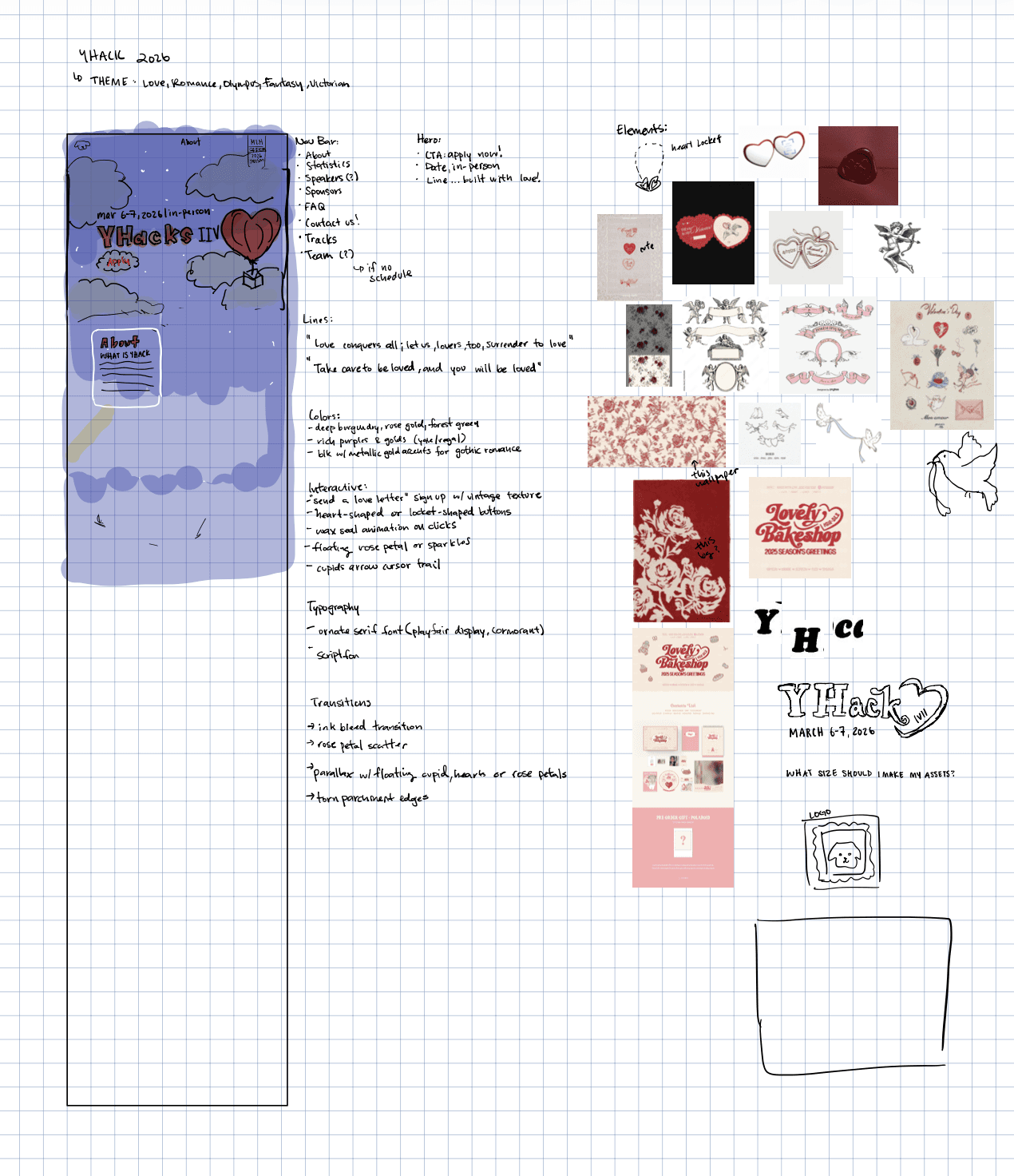
With the foundation Mandy built, I kicked off with a broad brainstorm. My goal was to think expansively before narrowing — exploring every direction before committing to any. Some of the key ideas that emerged at this stage:
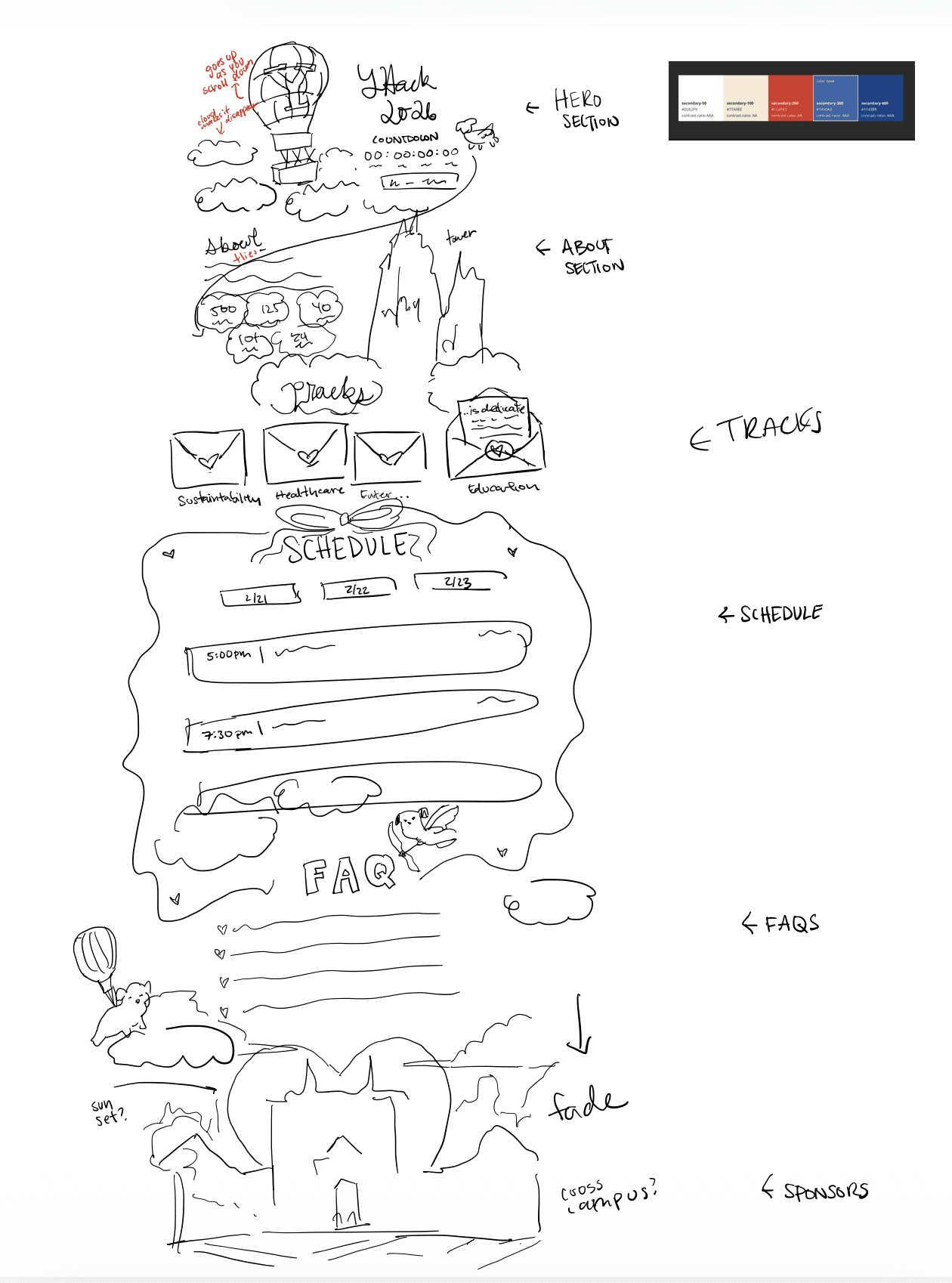
A sky-to-ground scroll narrative
the page would visually "descend" from clouds and sky at the top to a grounded, lush environment below, following Handsome Dan on his journey.
Layered parallax animations
clouds, floating islands, and illustrated elements would shift at different speeds as the user scrolls, creating depth and a sense of movement.
Romantic micro-moments
envelopes that open, wax seals, postcards, and love letters woven into the UI to reinforce the Valentine's theme without being heavy-handed.
With a rough sketch, I finalized the typography as well as key elements such as the custom type logo! There are still hints of my initial sketch that are in the final deliverable but as you can see, it is completely different.
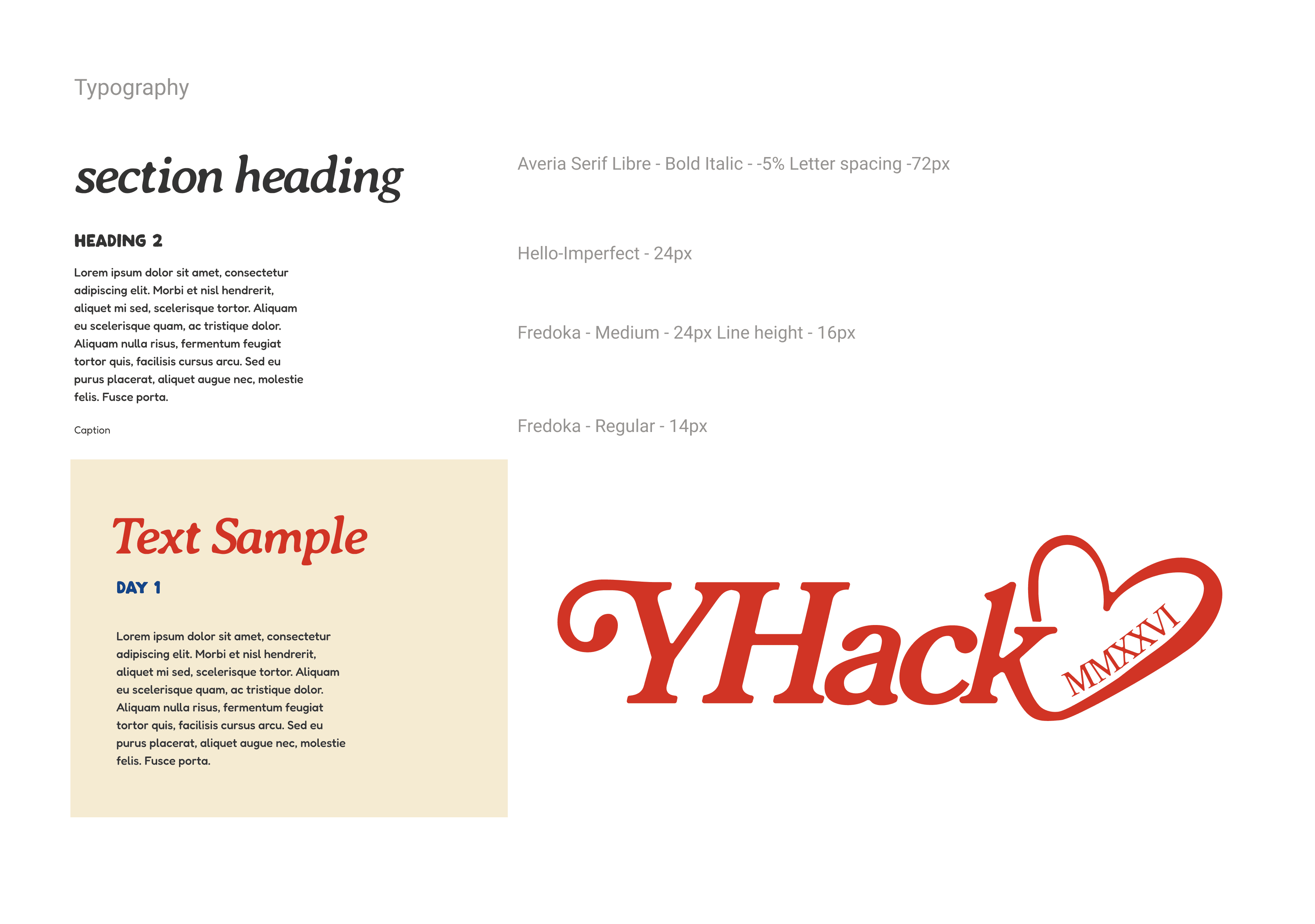
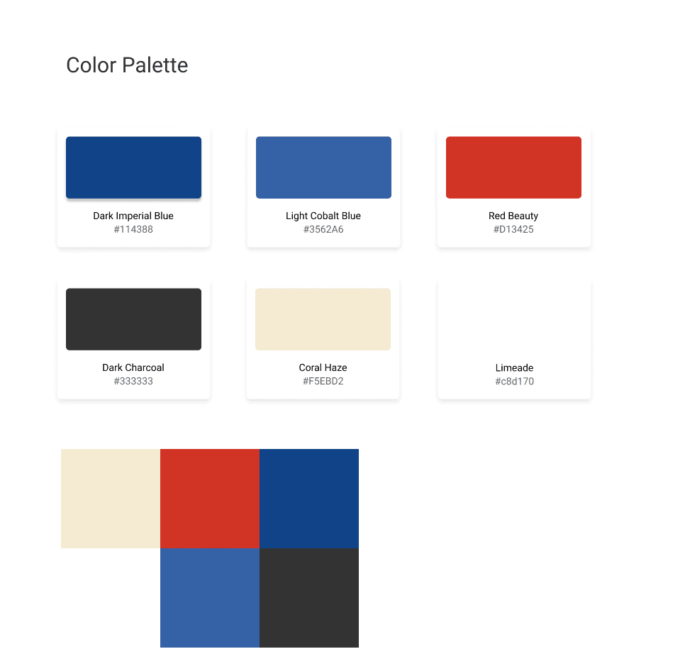
<- Designer Mandy's Selected Color Scheme!
MID-FIDELITY
Nailing Down the Content
Using the brainstorm as a springboard, I moved into mid-fidelity with one guiding question: "How do we strike a balance between immersiveness, cohesiveness, and cool features — while staying realistically executable and clearly communicating the content?"
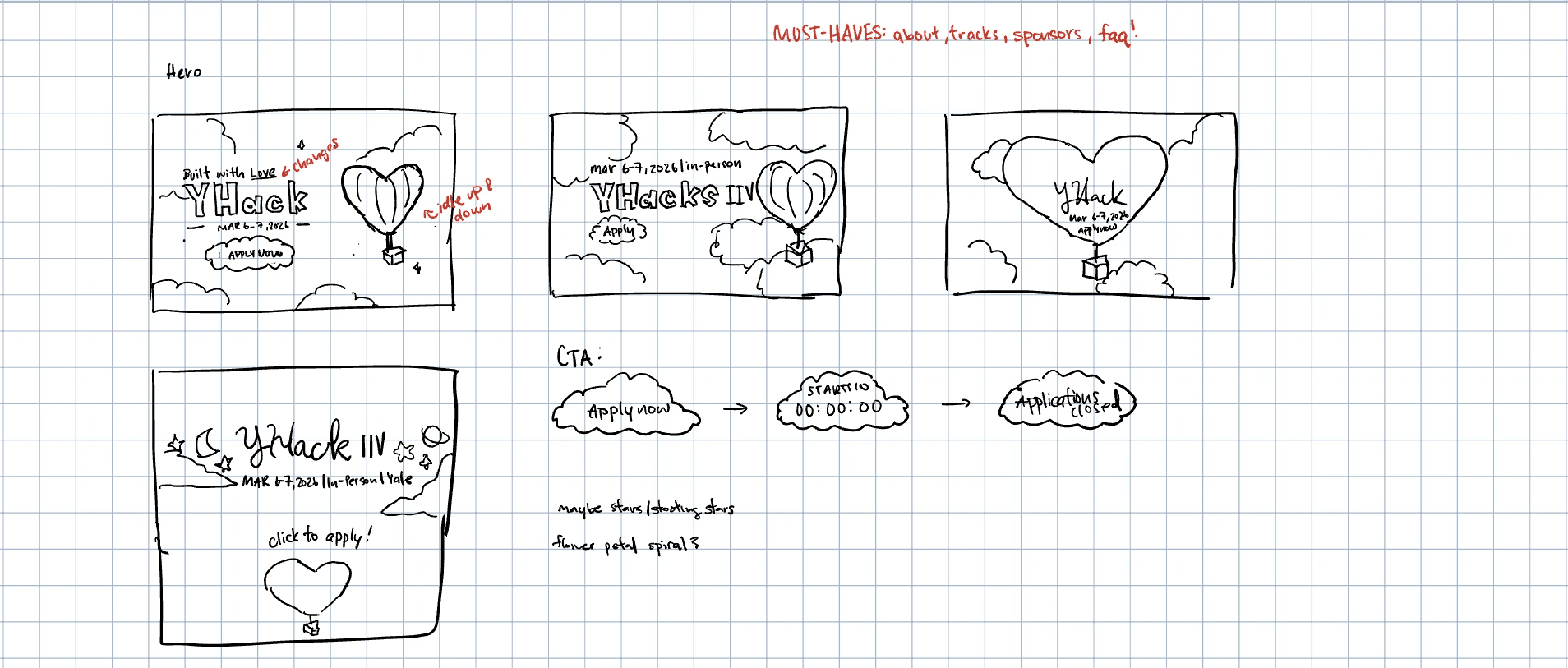
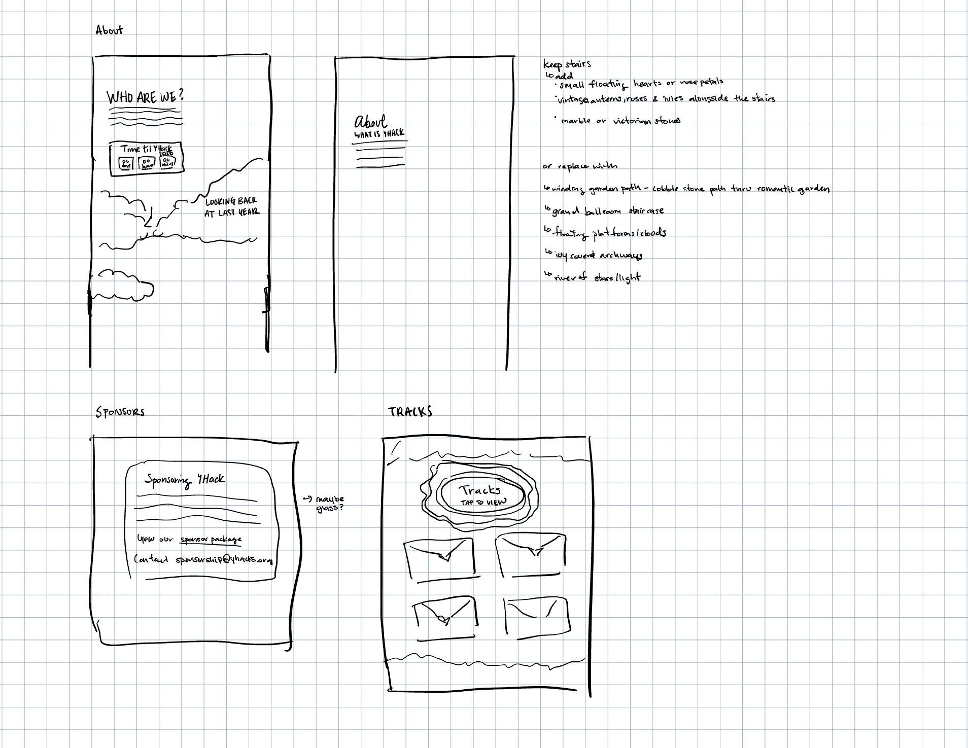
This stage was about structure. I locked in the content hierarchy, determined which scroll interactions were feasible, and started identifying exactly which custom assets we'd need to build.
Section order was finalized — Hero → About → Tracks → Sponsors → FAQ → Footer — prioritizing the emotional hook before the logistical details.
Storytelling anchors were placed — key scroll moments were mapped out to ensure the narrative felt continuous rather than choppy.
Asset requirements were scoped — I catalogued every custom graphic needed and flagged which ones needed to be created vs. adapted from existing branding.
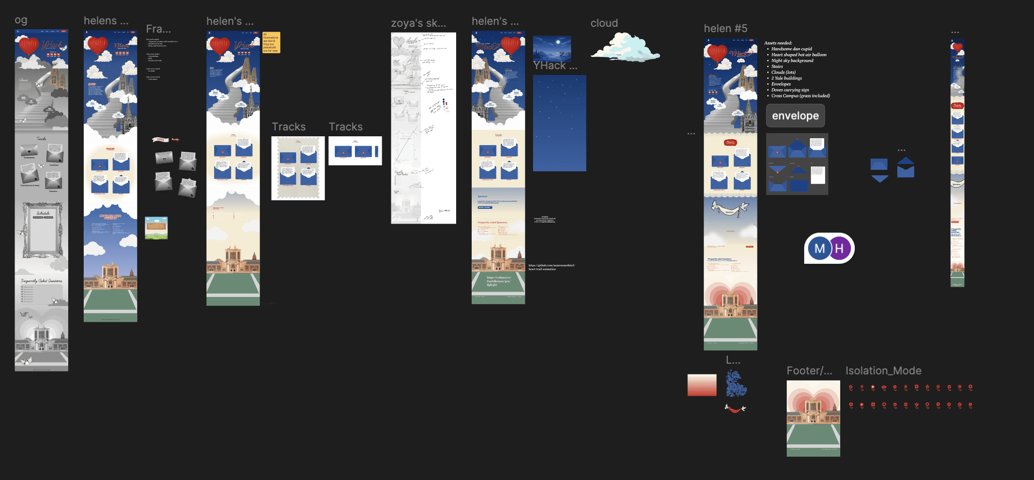
Peep all my sketches and drafts! I went through too many iterations…
DESIGN CHALLENGE
Defining and Completing Graphic Asset Requirements
The jump from lo-fi to hi-fi was where things got genuinely hard. I had a clear vision, but placeholder boxes couldn't capture it — and without the actual illustrated assets, the design felt hollow. We needed custom graphics, and a lot of them.
This meant working closely with Mandy to brief, iterate, and refine assets like the cupid Handsome Dan, and environmental elements, while I tackled assets like the clouds, wax stamps, envelopes, postcards, and Sterling Library myself. Coordinating the asset pipeline — knowing what to prioritize, what could wait, and what was blocking development — became its own design challenge.
Thanks to Mandy and Rohan, I developed many iterations by taking into consideration their perspectives and feedback!
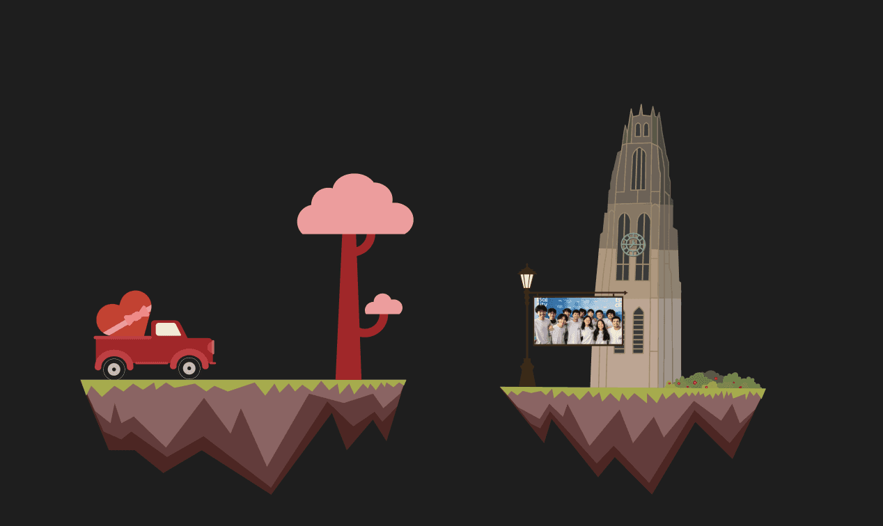
Floating Islands (scrapped)
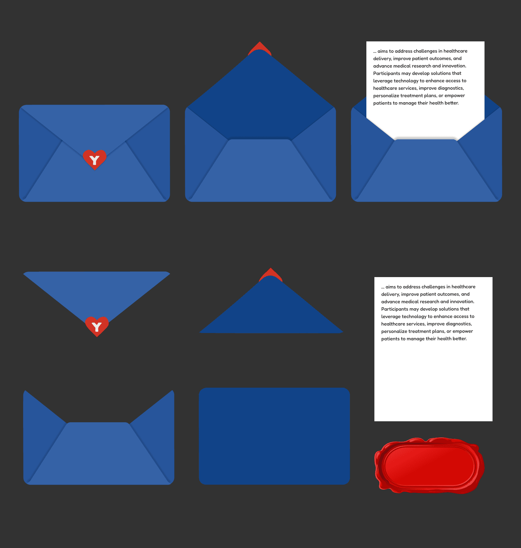
Envelope Assets
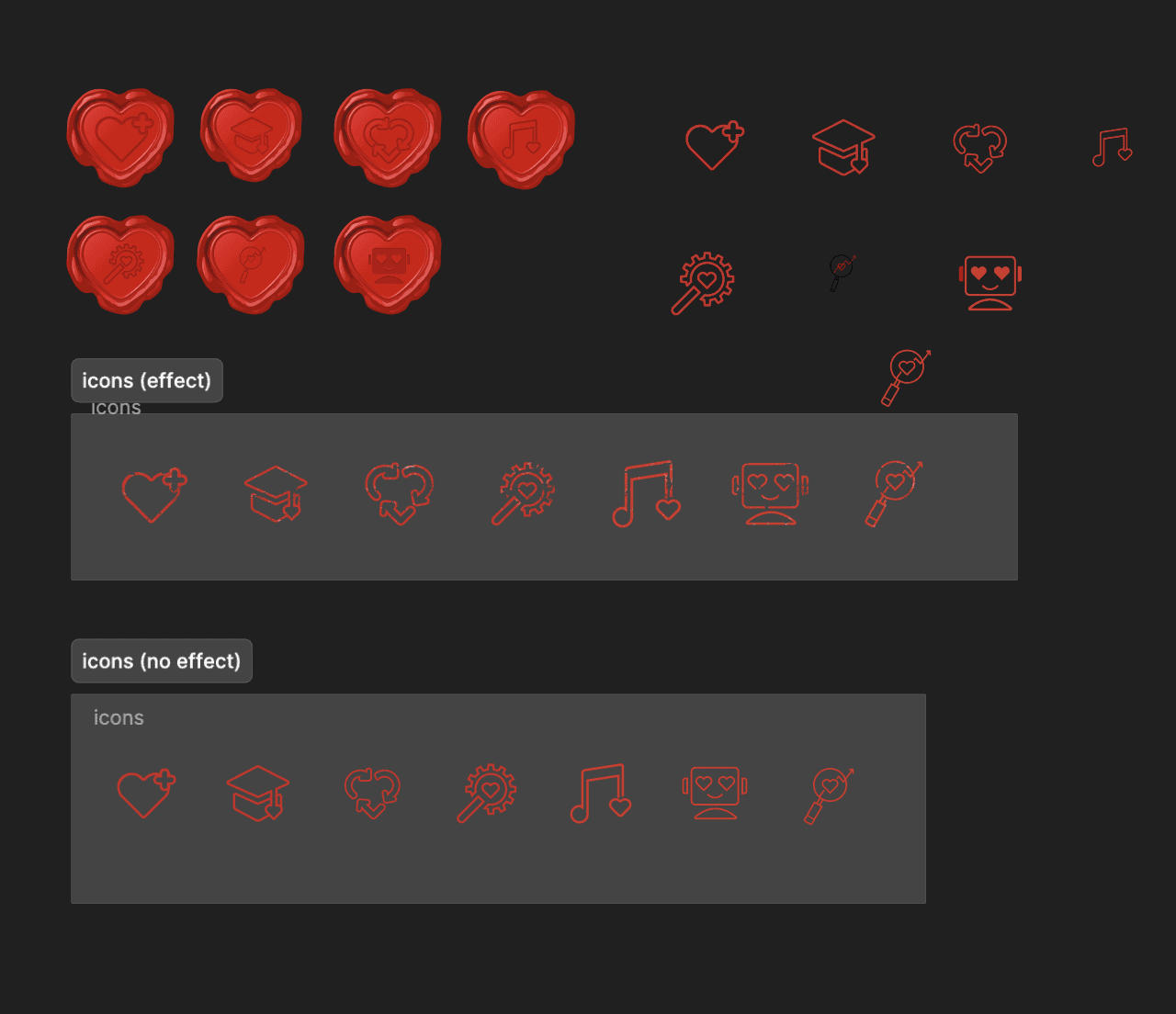
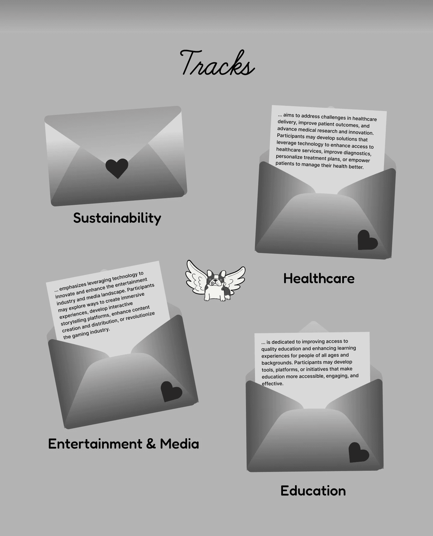
Track Icons
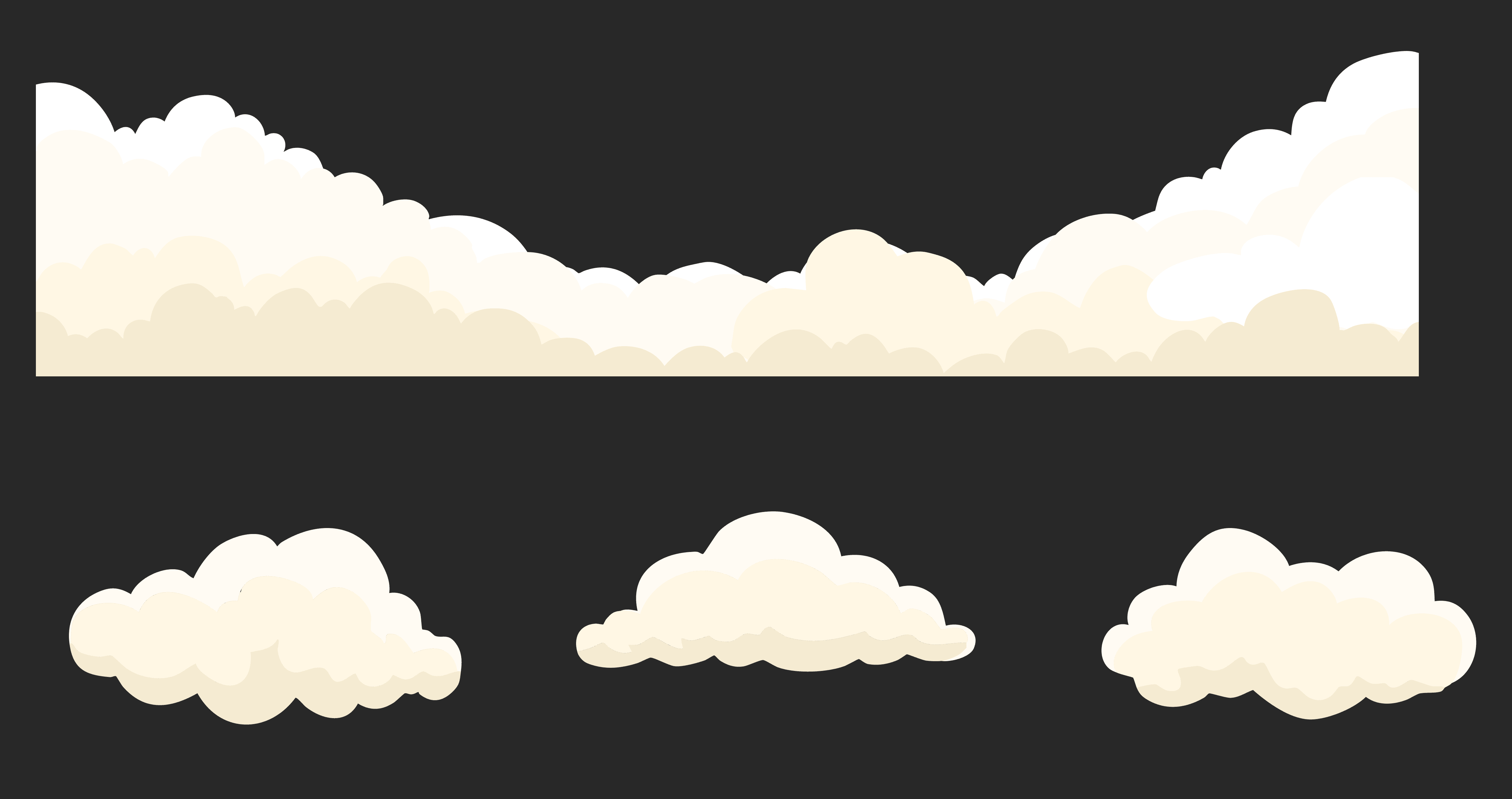
Clouds Assets
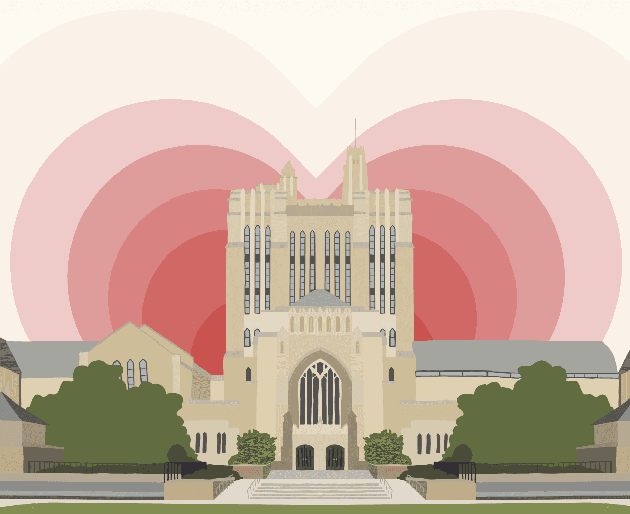
Sterling Library
HIGH-FIDELITY
Putting Everything Together
Once the assets were in hand, building the handoff file was meticulous work. The goal was to communicate three things simultaneously: what each section looks like at rest, how elements animate and shift as the user scrolls, and exactly where each asset lives — all while accounting for mobile, tablet, and ultrawide screen sizes.
The last and most time-consuming asset — Sterling Library — took significant effort to get right. Once it was complete, I coordinated the full handoff with Rohan, setting up a shared drive of organized SVG assets and walking through design decisions together. I leaned into his feedback heavily, especially in areas where my lack of web development knowledge left blind spots. That back-and-forth shaped a lot of the final decisions.
Phase 3: Results
FINAL DESIGN
A Website Built with Love
Here’s the full list of features I designed.
Hero
YHack Custom Typography
Banner clouds layered parallax scroll

About YHack
Countdown timer with heart icon ticks
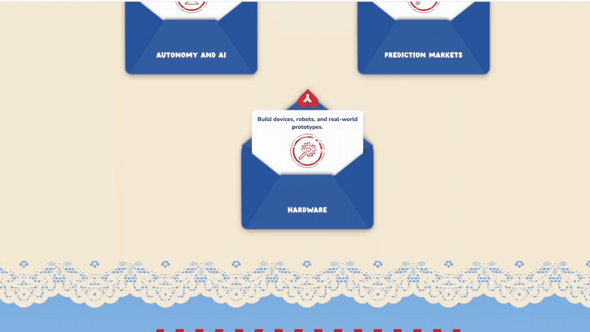
Tracks
Envelope open/close animation on hover
Stamp ring decorative overlay
Lace border scroll reveal
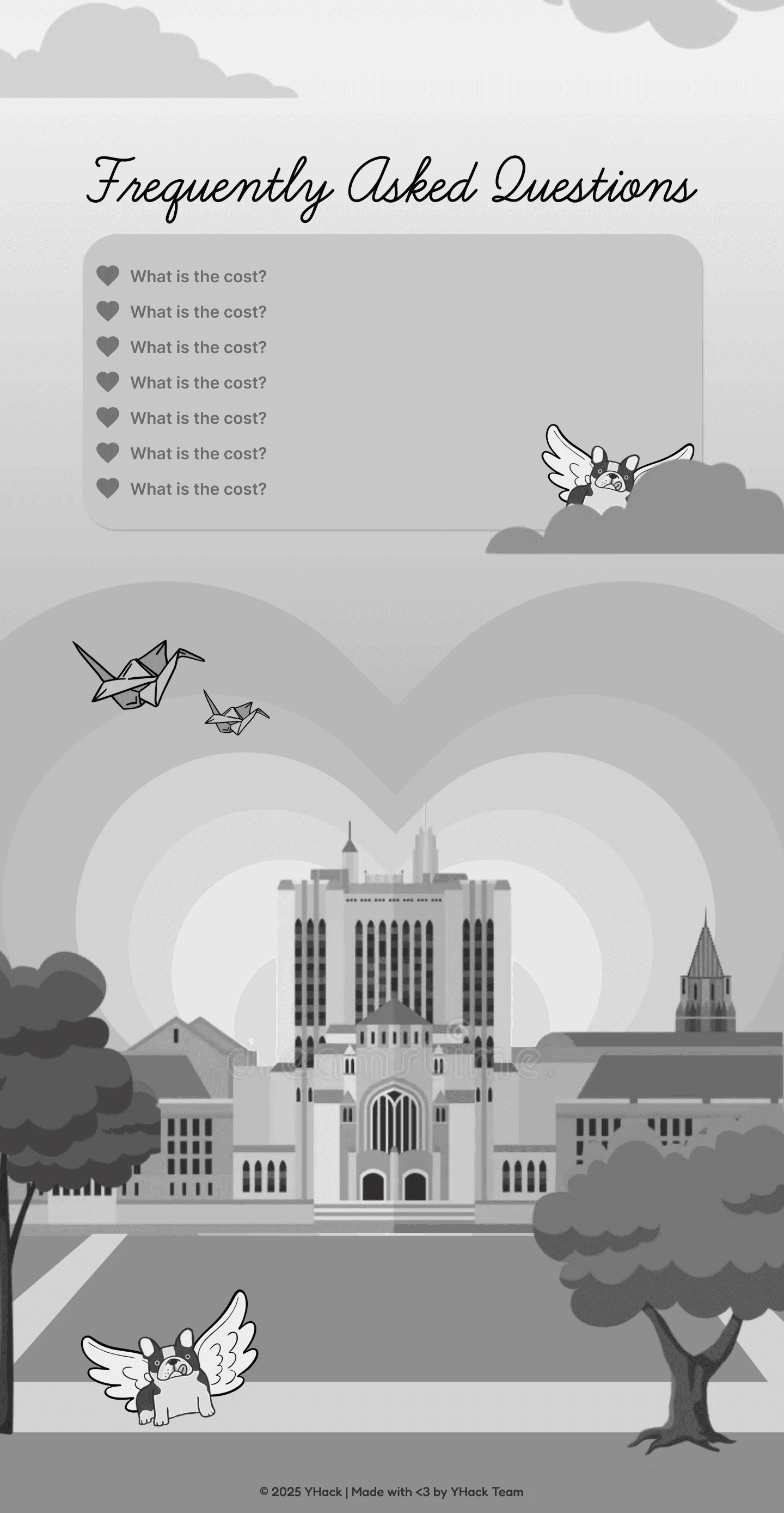
FAQ
FAQ postcard with Stamp decorations
Accordion expand/collapse on click of heart icon
Footer
Sterling Memorial Library! (Took me way too long…)
REFLECTION
Challenges & Outcomes
Navigating an Experimental Process
Because so much of this project was experimental, execution was rarely straightforward. I found myself putting in more time and effort than I anticipated, and looking back, that was largely a product of inexperience. But those extra hours taught me to iterate with purpose. The project went through countless revisions, and every single one of them was shaped by valuable feedback from Mandy and Rohan. Without them, it wouldn't have reached where it is today.
Learning What It Truly Means to Work Cross-Functionally
YHack gave me a firsthand understanding of what it means to operate within a cross-functional team. It's not just about doing your part. It's about staying aligned, staying communicative, and trusting the people around you. A huge thank you to Mandy and Rohan for making that possible.
Made with ❤︎
2026 © Helen Huang